
Umami Hottie
Bringing a restaurant-born ramen brand to retail
Umami Hottie began inside Ramenwell, Chef Harold Jurado’s San Francisco ramen restaurant, as a line of chili oils sold directly to customers.
The products had an early identity, but the brand had bigger ambitions. Harold wanted to move beyond the restaurant, launch a line of frozen ramen, earn retail distribution and ultimately build Umami Hottie into a nationally recognized food brand.
Avidity partnered with Umami Hottie to create the strategic foundation, identity and packaging system needed to make that next stage possible.
Brand Positioning
Brand Identity
Packaging System Design
Trade Show
Sales Materials
Born in a kitchen, not a board room
Umami Hottie had something most emerging food brands have to work hard to establish: authentic culinary credibility.
The brand grew directly out of Ramenwell, where Harold and his team had spent years developing and serving restaurant-quality ramen. The challenge wasn’t inventing a story around the product. It was translating that experience into a brand shoppers could understand in seconds.
The existing chili oil identity had been created primarily to support sales through the restaurant. Expanding into frozen meals—and eventually broader retail distribution—required a much more complete and scalable system.
We needed to create a brand that could communicate authentic ramen culture while still feeling contemporary, approachable and distinctly its own.
Finding their own-able space
Much of the frozen Asian food category falls into a few familiar visual territories. Some brands lean heavily into ornate, traditional design cues. Others adopt the straightforward aesthetic of products commonly found in international markets.
Umami Hottie had an opportunity to occupy a different space.
The brand could embrace its Japanese culinary influences without feeling overly traditional. It could feel bold and youthful without becoming loud or juvenile. And it could communicate premium, restaurant-quality food without falling into the restrained visual language often associated with upscale brands.
That led us to a creative framework built around contrast:
Cultural, but not traditional.
Bold, but not bright.
Classy, but not boring.
Modern, but not flat.
Friendly, but not childish.
Those principles became the filter for the entire brand system.
Creating a distinctive visual identity
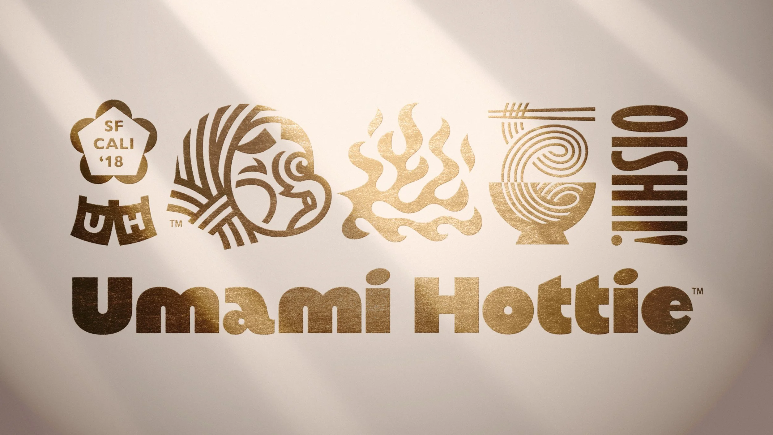
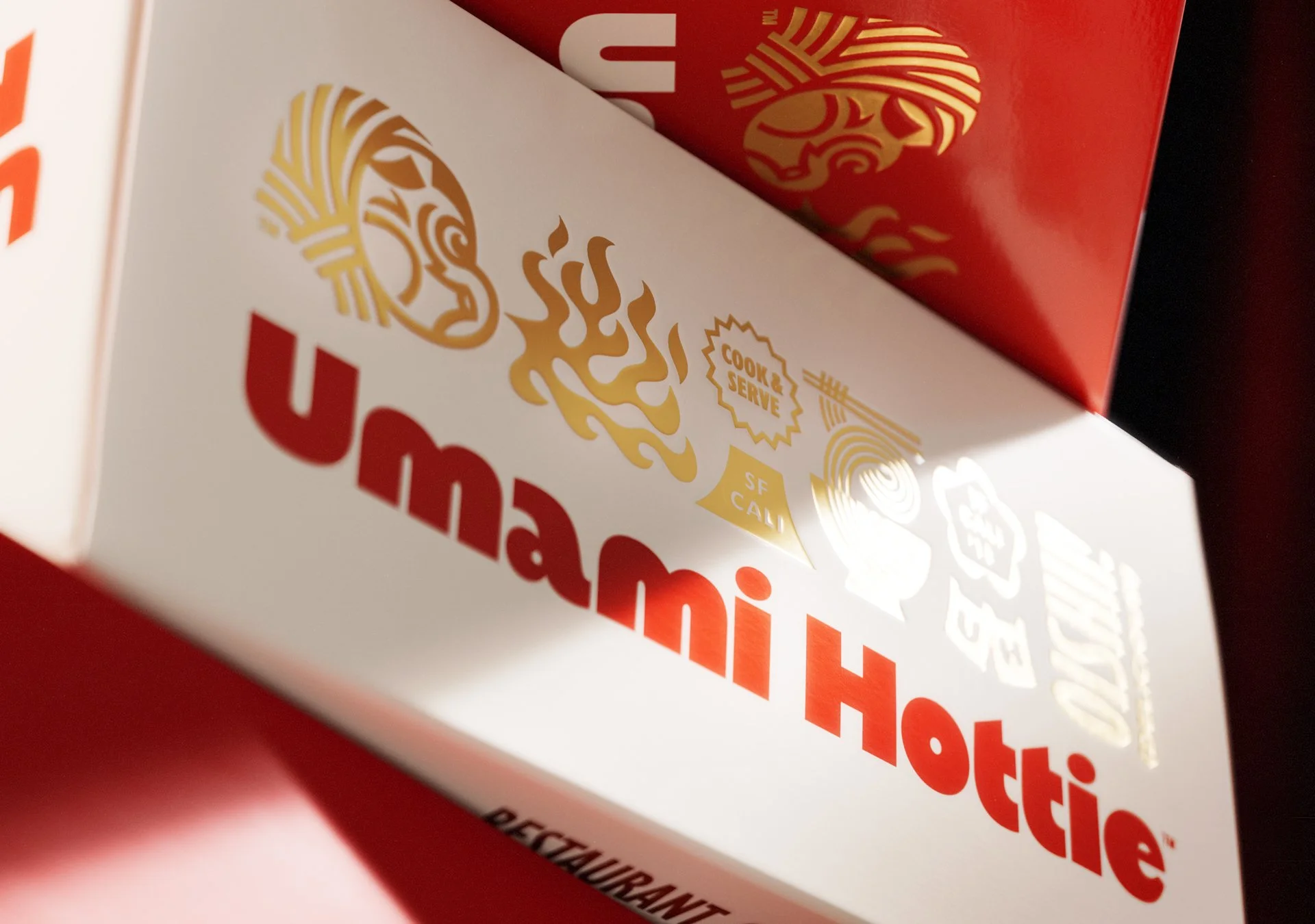
At the center of the new identity is Umami Hottie’s hyottoko-inspired character.
The hyottoko is a figure from Japanese folklore commonly depicted with a puckered mouth associated with blowing fire. For Umami Hottie, the character became a fitting symbol for the heat and spice found throughout the brand’s products.
We surrounded the character with a broader visual language influenced by Japanese food and culture. Noodles, chopsticks, ramen bowls, curtains and other recognizable references were distilled into graphic illustrations and icons that could be used across packaging, brand materials and future applications.
Rather than reproducing these elements traditionally, we gave them a more expressive and contemporary character.
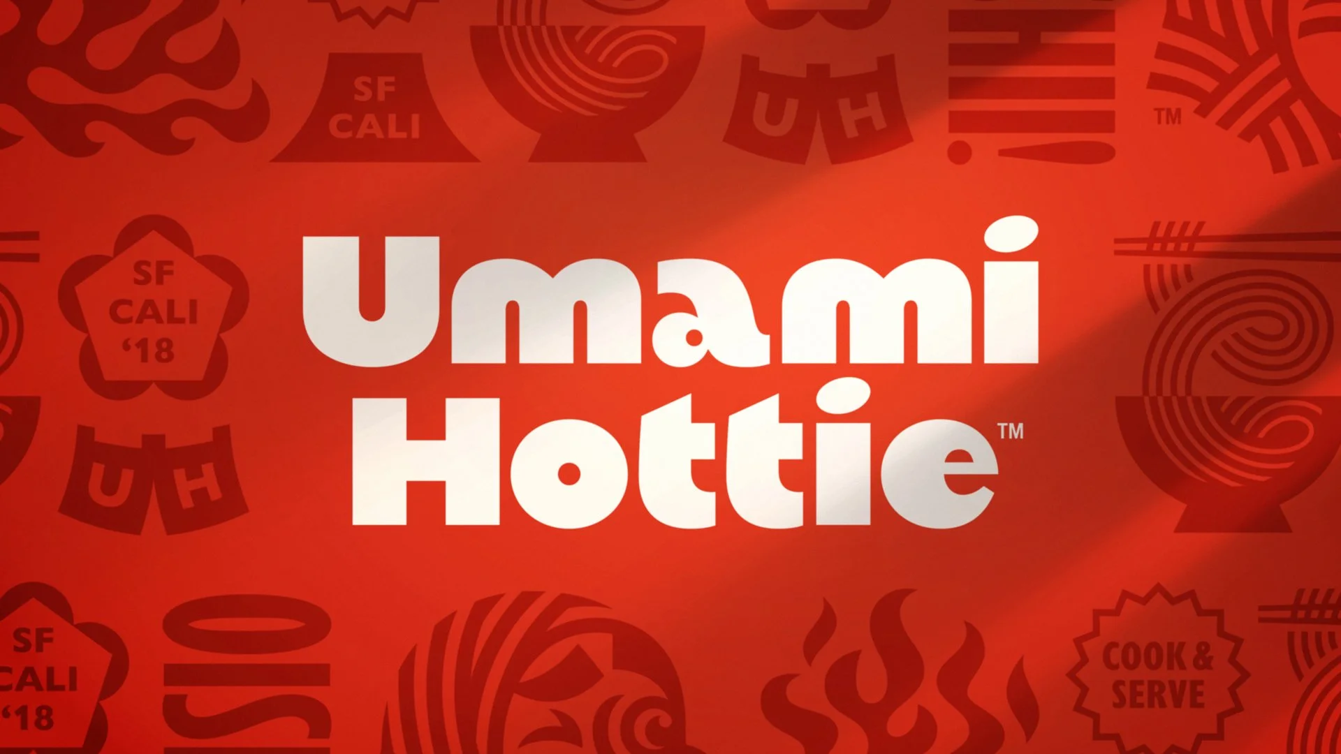
The typography follows the same approach. The large, rounded Umami Hottie wordmark is friendly, confident and easy to recognize, while secondary typography adds dimension and personality.
Metallic gold became another important part of the system, giving the identity a more elevated quality and balancing the playfulness found elsewhere in the brand.
A name with personality built in
We didn’t create the Umami Hottie name, but it gave us plenty to work with.
“Umami” connects directly to the savory depth of flavor at the heart of ramen. Paired with “Hottie,” the name becomes more expressive—almost like a reaction to something desirable, craveable or spicy.
That combination helped give the brand permission to have more personality than many of its competitors.
The identity needed to feel just as memorable as the name itself.
Designing for the freezer aisle
Frozen ramen represented Umami Hottie’s biggest step from restaurant product to retail brand.
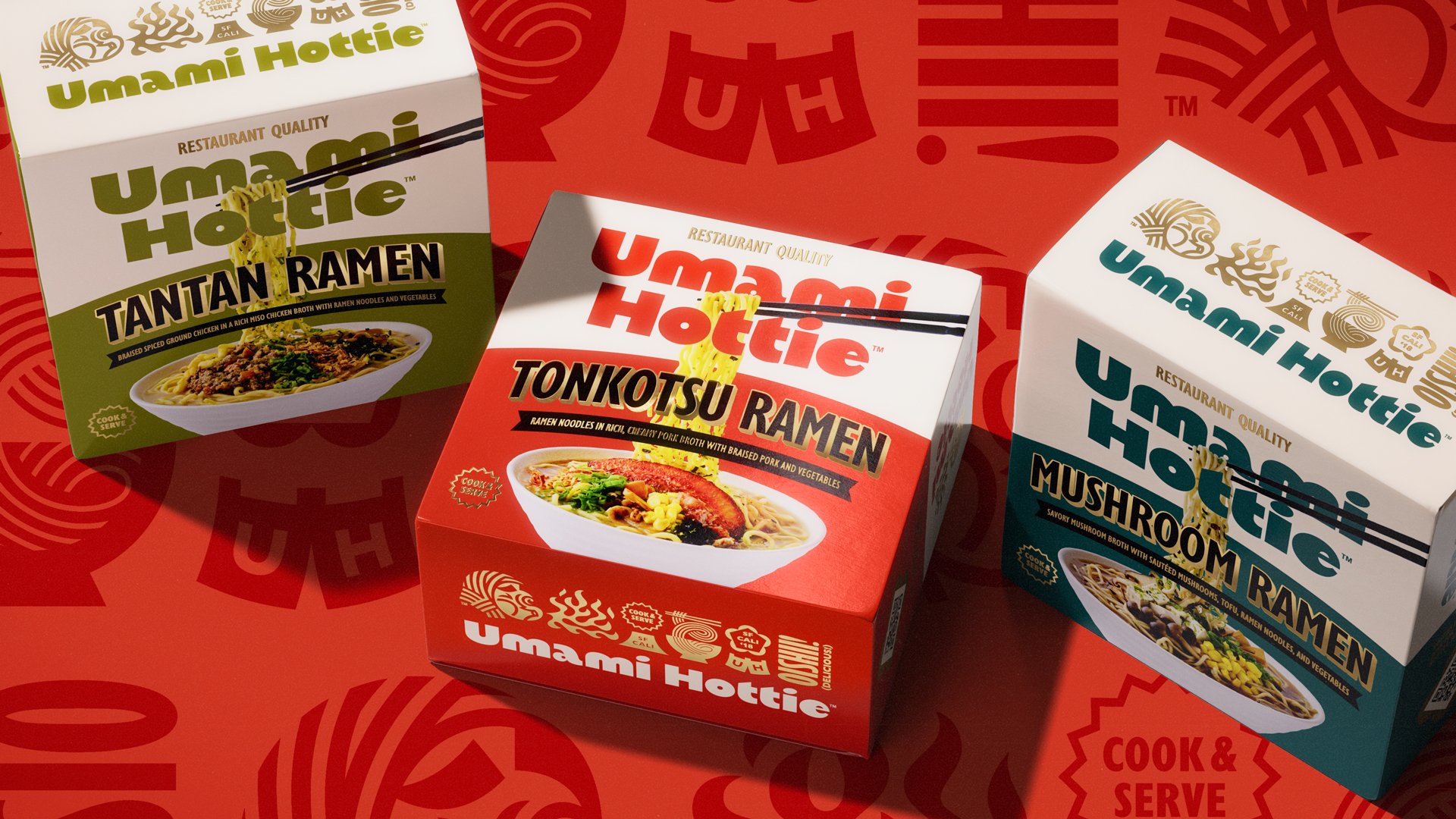
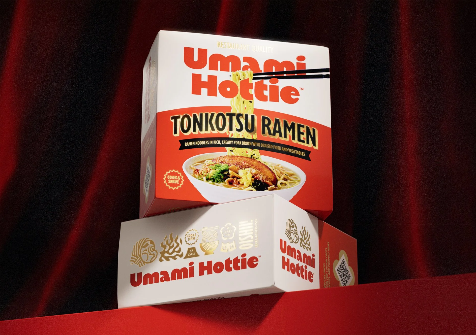
Because shoppers would be encountering the brand for the first time, we gave the Umami Hottie name significant visual real estate on the front of each carton. Building recognition mattered more than treating the logo as a small signature.
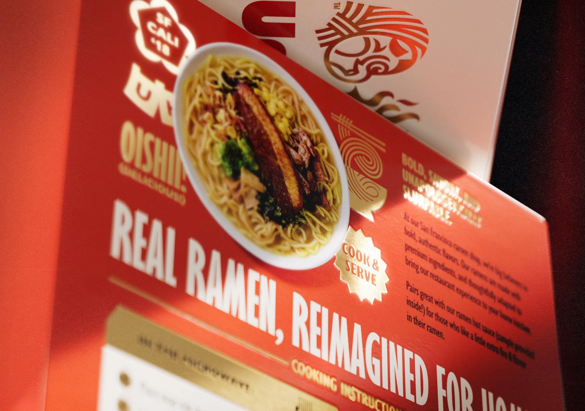
The chopsticks and noodles interacting with the wordmark create an immediate ramen cue while also guiding the eye downward from the brand name, to the product variety, to the finished bowl.
The hierarchy was designed to work quickly: Brand. Product. Appetite.
Large-scale photography of the prepared ramen reinforces the most important product promise: this isn’t simply another convenient noodle meal. It is intended to deliver a restaurant-quality ramen experience at home.
Creating depth in a crowded category
We deliberately avoided making the packaging feel overly clean or digitally flat.
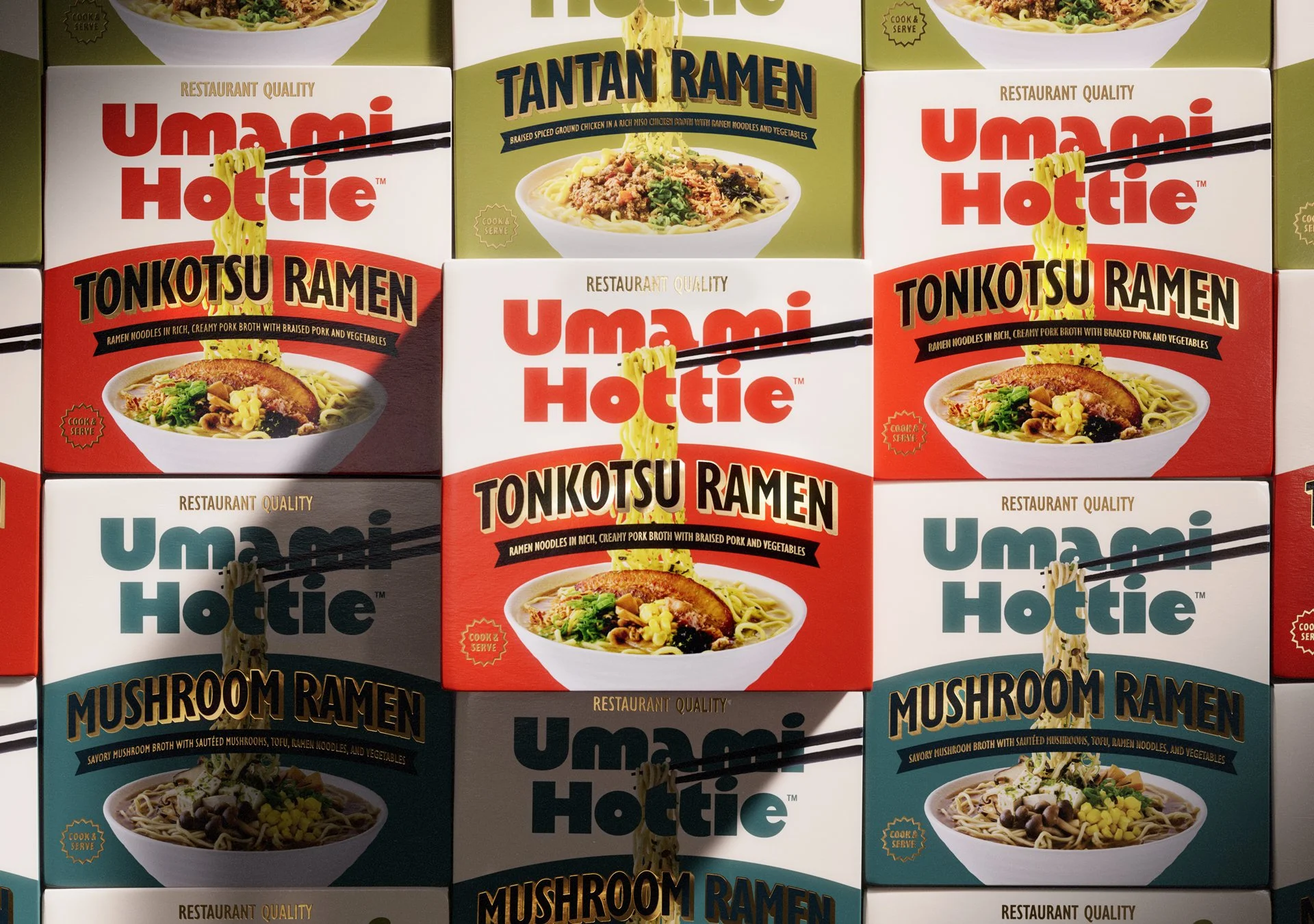
The dimensional typography used for the ramen varieties gives Tonkotsu, Tantan and Mushroom Ramen greater physical presence. Metallic gold foil introduces another layer of depth and creates visual movement as the package catches light.
Those elevated details are balanced by bold blocks of color and strong food imagery, keeping the package energetic and approachable rather than precious.
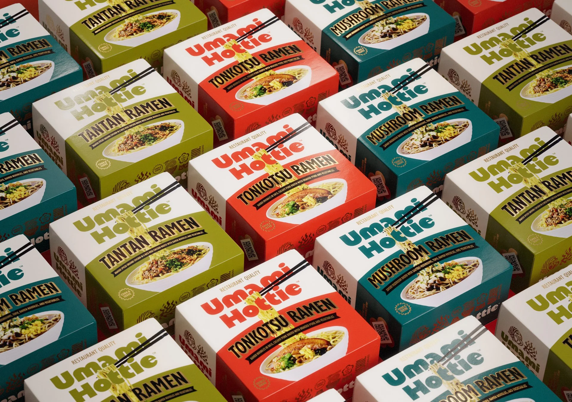
Each SKU uses the same core architecture while receiving its own accent color, making the system easy to navigate and highly recognizable as a family.
One brand across multiple product lines
The system wasn’t designed only for frozen ramen.
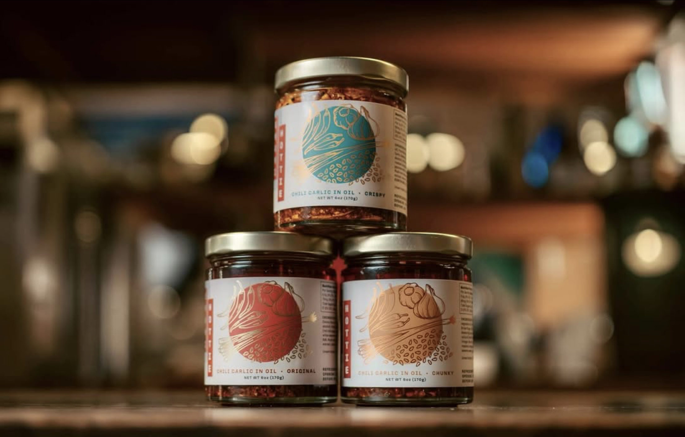
Umami Hottie’s existing chili oils were also redesigned within the new identity, allowing the brand to stretch naturally from the freezer aisle to the pantry.
Although the package structures are dramatically different, they share the same visual DNA: illustration, typography, color, metallic accents and cultural references.
That consistency was important for a brand with ambitions beyond a single product line. Instead of designing three ramen cartons, we were building a system capable of supporting whatever Umami Hottie creates next.
Built for the next stage of growth
The new Umami Hottie identity transformed a restaurant-born product into a more complete consumer brand.
The frozen ramen line launched with three varieties—Tonkotsu, Tantan and Mushroom—supported by a redesigned chili oil range and a cohesive set of brand and sales assets.
Umami Hottie has since begun introducing the products to retail buyers and secured its first retail accounts following its initial trade show appearances.
The work has also earned Gold recognition from Food & Beverage Magazine for packaging design, while all three Umami Hottie ramen varieties received Gold recognition for taste.
For a brand built around bringing the experience of a ramen restaurant home, that combination of product and design recognition feels especially appropriate.